Employer Wellness Participant Experience
Health and wellness participant website experience redesign.
Employer Wellness Participant Site
Purpose: This project was a much needed project to improve the look, feel and user flow on an employer wellness website. The site was outdated and had out grown its original purpose.

This was a collection of all responses we had received from end users.

This was a photo of a session with the internal users on items they would like to see added to the new site, items they would like to change, and Items they hate.

This was used to get initial approval on the project from the business and enabled us to get funding.

This was also in the original project proposal to give development an overall view of the needs and pages included.

This was a more in depth look at pages that were affected and possible cross-linking capabilities.

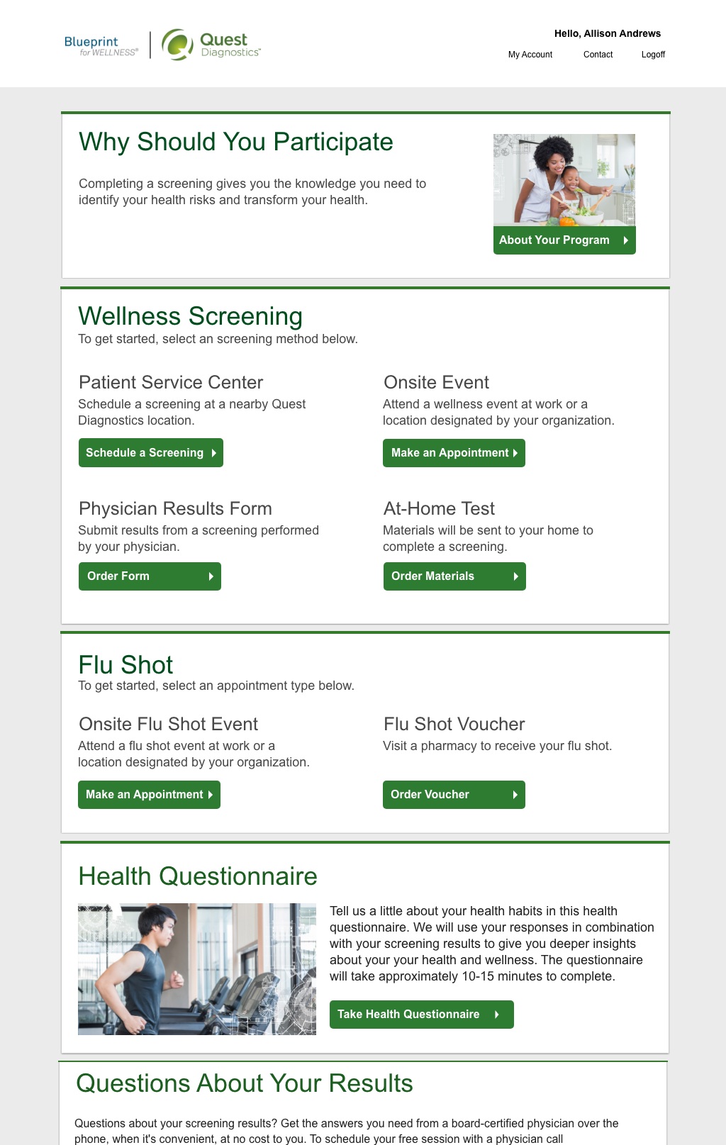
This was the original homepage of the website before the redesign.

This was the final design.

Sample of the Participant Dashboard. This page is dynamic based on the state of the participant and what products are offered to them.

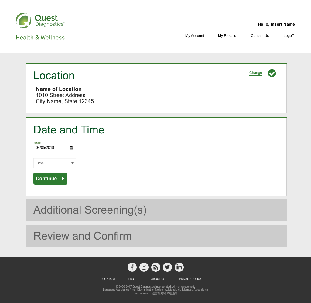
Simple implementation of a map and locations to help the participant get to where they need to be.

This page had a large exit rate. So we redesigned it to be easier to use.


Steps to Completion
Meeting with all business units to collect complaints and issues we were seeing on a daily or monthly basis.
User Testing was completed at some of our more unique clients in an effort to collect data on experience changes.
User flows were created based on the intended purpose of the employer wellness program.
Wireframes were completed and shown to key business team members.
Final designs were worked out and presented to business.
Final stage was working with the UI developers to implement the business requirements.
Challenges Uncovered
Schedule for the end user was difficult on mobile and desktop versions. There was an exit rate of 46.3% on the date selection screen. The users found it confusing and frustrating so they were leaving the site
Registration was asking for information that the end user did not understand. We hadn’t built trust with the users so many of them didn’t want to give so much personal information.
End-users wanted to easily get to their historical results. Total steps to get their historical results was nine clicks.
“I can’t tell when my results are ready or if they have an issue and can’t give me my points.”
“I don’t understand how to select other locations so I can complete my Wellness Program”
“Why do you need my home address if I am accessing my results online?”
How did we measure up
Increased Mobile Registration by 19.2%
Increased first time scheduling on a desktop by 32%
Increased first time scheduling on a mobile device 48%
Decreased the exit rate on a mobile device by 49%
Performance Goals
Increase Mobile Registration Success by 7%
Increase first time appointment scheduling on the desktop by 5%
Increase first time appointment scheduling on a mobile device by 10%
Decrease exit rate on a mobile device by 21%